
Photo Source: Riccardo (Pexels)
ArcGIS Dashboards puts the power of location intelligence at your fingertips, but mastering its full potential takes more than just dragging and dropping widgets—these expert tips will help you level up your dashboards and deliver insights that truly stand out.
What is ArcGIS Dashboards & How Does it Work?
ArcGIS Dashboards is an app within the ArcGIS Online and Portal ecosystems that allows users to convey geographical information and other location-based analytics using interactive data visualizations on a single screen. The powerful dashboards can be used …“To help make decisions, visualize trends, monitor status in real-time, and inform communities.”
ArcGIS dashboards have multiple widgets that include maps, tables, graphs, and other interactive components that can be tailored to the user’s needs and are customizable. Learning how to use and customize a dashboard can be daunting due to all the pieces that work together; and even after you get comfortable creating one, there can still be a lot of little (and sometimes big) things to learn. So after you get started with ArcGIS Dashboards, here are some tips and tricks to help grow and make your dashboards even better!
The demo dashboard that was used for the tips and tricks listed in the following section can be viewed here: Public School Characteristics. All data used is sourced within the dashboard and are either Esri Living Atlas layers or publicly shared online layers.
Tip #1: Learn How to Duplicate a Dashboard
Have you ever seen an ArcGIS Dashboard that you liked and wondered how the creator accomplished everything?
Do you want to challenge yourself to learn more things about dashboards that you may not have been aware of?
Does your organization have a dashboard template that you want to use or build off of but don’t want to start completely from scratch?
The easiest way is to save the dashboard as a new dashboard.
Grab the Item ID of the dashboard you want to duplicate:
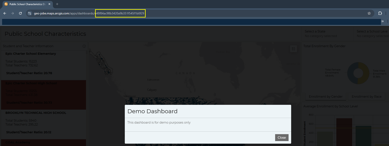
The location of the item ID for the dashboard that you are copying.
Then, go to your dashboard app and select Create a new dashboard. From the new dashboard screen, add #id=e48f84ac98b3420a9b351f545f1b0f29 (or your item ID) to the end of the URL. The Title and summary will auto-fill.
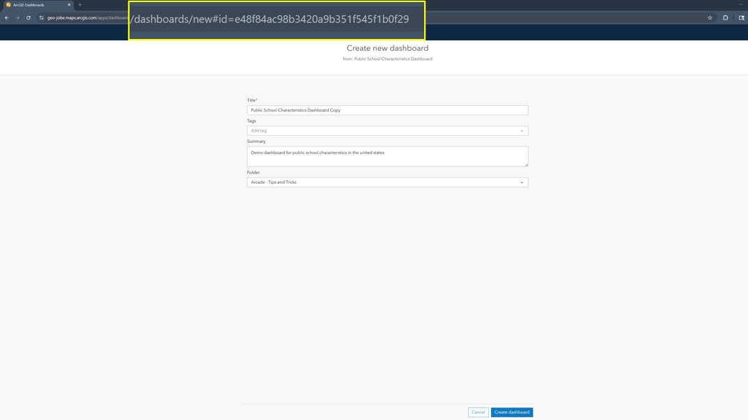
A view of the create dashboard screen after the new#id has been added.
If the data/map is not set to a shared level that gives your permission to use it, then the data and map will not be visible, and some of the widgets, therefore, will break. However, the underlying theme will be there, and you will still also be able to see data expressions. Also, if the dashboard does not allow saving, you won’t be able to duplicate it.
Tip #2: Data Expressions and Advanced Formatting
Another tip is to learn how to use Data Expressions and Advance Formatting, the difference between them, and the appropriate way to use them. These expressions are built on the ArcGIS Arcade expression language. The expressions can be used to expand your dashboard and provide better insights in a more thoughtful way.
The first type of expression—data expressions—return a modified feature set and are typically used when a user does not have access to modify the underlying dataset or needs the data to be displayed in a way that is not currently available with built-in functions of the widgets.
An example of a data expression that can be useful is to create a data expression that returns counts of data in bins. The following example created bins based on the number of K-12 students that did not have access to the internet, and how many counties fell into that bin.
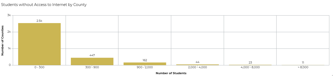
The final graph showing the number of counties in each group of students without access to the internet. The dataset is from ACS Context for Child Well Being – Boundaries.
Data expressions should be used sparingly and work better on smaller datasets. They are powerful, but can sometimes hinder the performance of the dashboard. If you are interested in going this route, be sure to look into best practices that Esri and others have released.
Advanced formatting uses ArcGIS Arcade to provide custom formatting to list elements and indicator elements. There are many uses, but a common use case is to have the element within the dashboard return a different background color if a given value of the feature is at a certain threshold.
In the following example, an advanced expression was used on a list element to make the background of the feature return red if the student/teacher ratio was over 30% for that school.
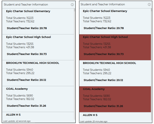
The list on the left is before the advanced formatting is added, and the list on the right is after it is added, making the schools that have a high student/teacher ratio stand out.
These are just starting ideas on when and where to use data and formatting expressions. An entire blog post can be written on different examples alone. A great place to view even more examples is Esri’s Arcade Git Hub.
Tip #3: Play Around with Different Looks and Settings
A third tip is to play around with different color schemes and formatting within the widgets, not just the default settings when you first add a widget. Going with the default settings does not always mean the best or most visually pleasing way. Even without getting into formatting expressions, play around with the display setting within each element and see what works and looks the best.
For example, see how adding an inner radius and border between the categories makes this pie chart on the number of enrolled students by gender easier and cleaner to read:
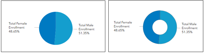
The pie chart on the left is before adding any style or changing the border, and pie chart on the right is after words.
Here is a change from the default theme and colors, to adding a theme and customizing the color and font. The layout was also moved around and adjusted to give the map and widgets a better flow. Simple changes and looking at different styles can make a huge difference in the initial presentation on your dashboard.
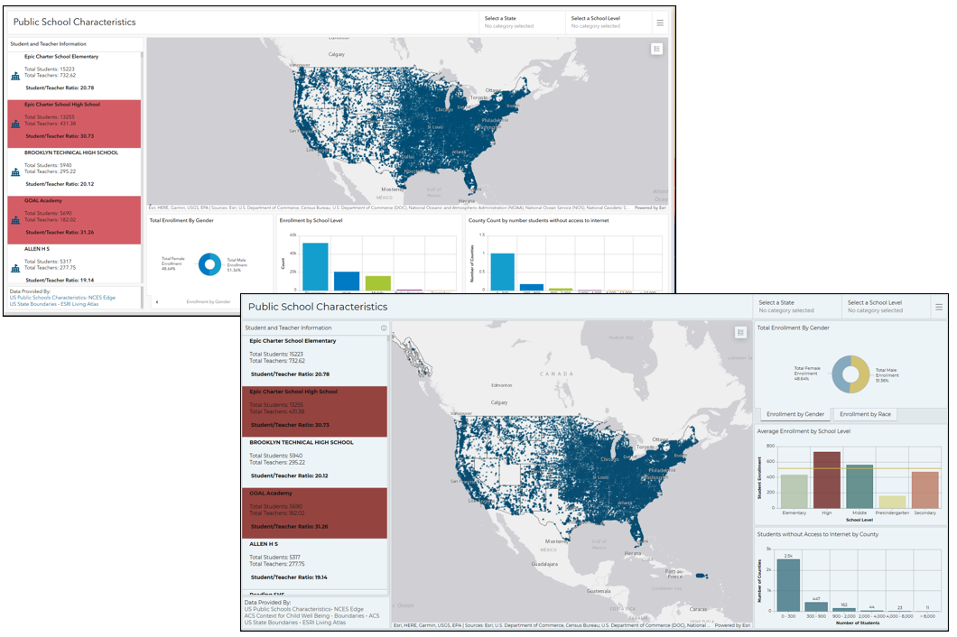
The dashboard at the top was before any style changes were applied, and the dashboard at the bottom was after.
Tip #4: Keep Up with Updates and Changes
Another tip is to keep up with updates and changes to ArcGIS Dashboards, both in the ArcGIS Online environment and the Portal Enterprise environment. It can be really easy once you get a workflow going or a dashboard created to not be aware of new releases that may make your dashboard set up easier, more efficient, or cleaner.
One example is that for a while, the category selector inline view was always the Esri default blue, and could not be changed. However, in AGOL, and as of Enterprise 11.4, the ability to use themes and have more control over other customization has been added.
The easiest way to view information on new releases is via the What’s New page. On this page, you can switch between the ArcGIS Online version and the different Enterprise versions. This can also be a good place to look if you are on an older version of Enterprise, and are looking to see if a feature that you have seen has been implemented in a new release of Enterprise or the version you are currently using.
Tip #5: Use Esri Resources
The most important tip is to utilize Esri’s resources.
This can be seen where most of the other tips link back to Esri pages, such as with tips #2 and #4. No one knows ArcGIS Dashboards quite like the creators and product engineers themselves, so looking over their blogs and update posts are some of the best ways to learn and get new ideas.
Beyond tutorials and how-to’s, you can also find example dashboard galleries and videos that go more in-depth on certain features. Here is a list of some of the places where you can find different dashboard inspirations. Some of these resources may require a My Esri account or Esri Community account to access.
- Esri Community
- Esri Dashboard Blog
- Esri Video
- ArcGIS Dashboard Gallery
- ArcGIS Dashboard Gallery by Esri Dashboards Team*
*Note: To easily access, change arcgis.com to your organization url.
Bonus Tips: Quality of Life
These are also smaller tips that make utilizing your dashboard more efficient and easier. One tip is if you have widgets in a row or column, and you want them to all be the same size, the quickest way is to go to the View tab, hover over the row or column you want to make the widgets the same size and select hover width evenly.
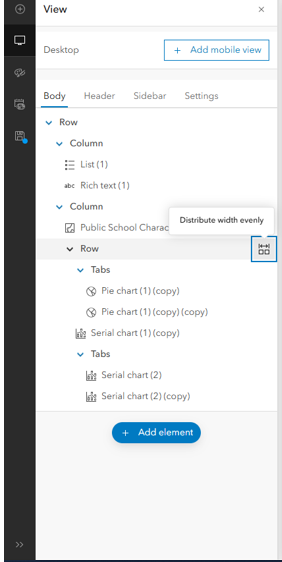
The location of the distribution width evenly option
Another tip to help with dashboard usage is to give all your widgets specific names, especially if your dashboard has a lot of widgets. This can get confusing when setting up a lot of actions or trying to keep things organized.
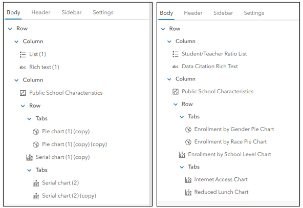
The screenshot on the left is before the widgets have been renamed, and on the right is after they have been renamed.
A last QoL is to check the settings, also in the View tab. Here, you can change options to allow the user to reset the dashboard (very useful if your dashboard has a lot of selectors or actions), be able to resize elements, or expand elements. You can also add a splash screen that displays when a user first opens the dashboard.
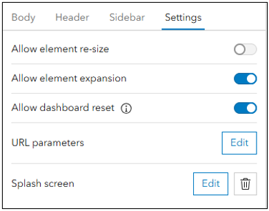
The available settings that you can change for your dashboard
Conclusion
All of the above are tips and tricks to help bring your dashboards to the next level. However, these are just a few suggestions and resources. Hopefully, they help you out on your dashboard journey. We can’t wait to see what cool dashboards you come up with.
And as always, if you need help with your ArcGIS Dashboards, or have other geospatial needs, please feel free to reach out to us via connect@geo-jobe.com.
Happy Dashboarding!

Like this article? Explore these others from our MapThis! blog:
- Unleashing the Power of Rust in GIS Development
- ArcGIS Pro: Critical Considerations for Storing Your Data
- WEBINAR: How XPGEO Studio Simplifies Imagery Workflows in ArcGIS
- Data & Detection: YOLO’s Role in Modern Geospatial Intelligence
- UAV Mapping: Maximizing Accuracy with Ground Control Points
- 25 Years of GEO Jobe: Mapping a Legacy of Innovation & Community
- WATCH: Sharing Your ArcGIS Services Easier, Smarter, & More Securely

About Our Company
GEO Jobe is a leading GIS software and geospatial solutions provider, serving over 10,000 organizations globally. GEO Jobe is best known for developing the most popular applications in the ArcGIS Marketplace, including Admin Tools for ArcGIS, Backup My Org, Clean My Org and Scheduler for ArcGIS.
GEO Jobe offers U.S.-based 24/7 Support solutions for organizations using Esri’s ArcGIS© System. GEO Jobe also offers professional services focused on Esri’s ArcGIS© System, including custom software development, enterprise solution implementation, data science and UAV data collection.
Founded in 1999, GEO Jobe is in its 25th year of operation, has been an Esri business partner since 2002 and is currently a Platinum Partner.